el-table二次封装 支持复选框表格嵌套 复杂类型表头等
二次封装el-table,复选框表格嵌套
·
序言
在后台管理项目开发中表格是使用频率最高的组件之一,为了提高开发效率和简化代码,对 Element UI 的 el-table 组件进行二次封装。通过抽象常用的配置项和操作,并提供简洁易用的接口,使用自定义 el-table 组件时只需专注业务逻辑,无需重复编写相同的代码。这样能够减少重复工作,提高可维护性和扩展性,使项目开发更高效便捷。
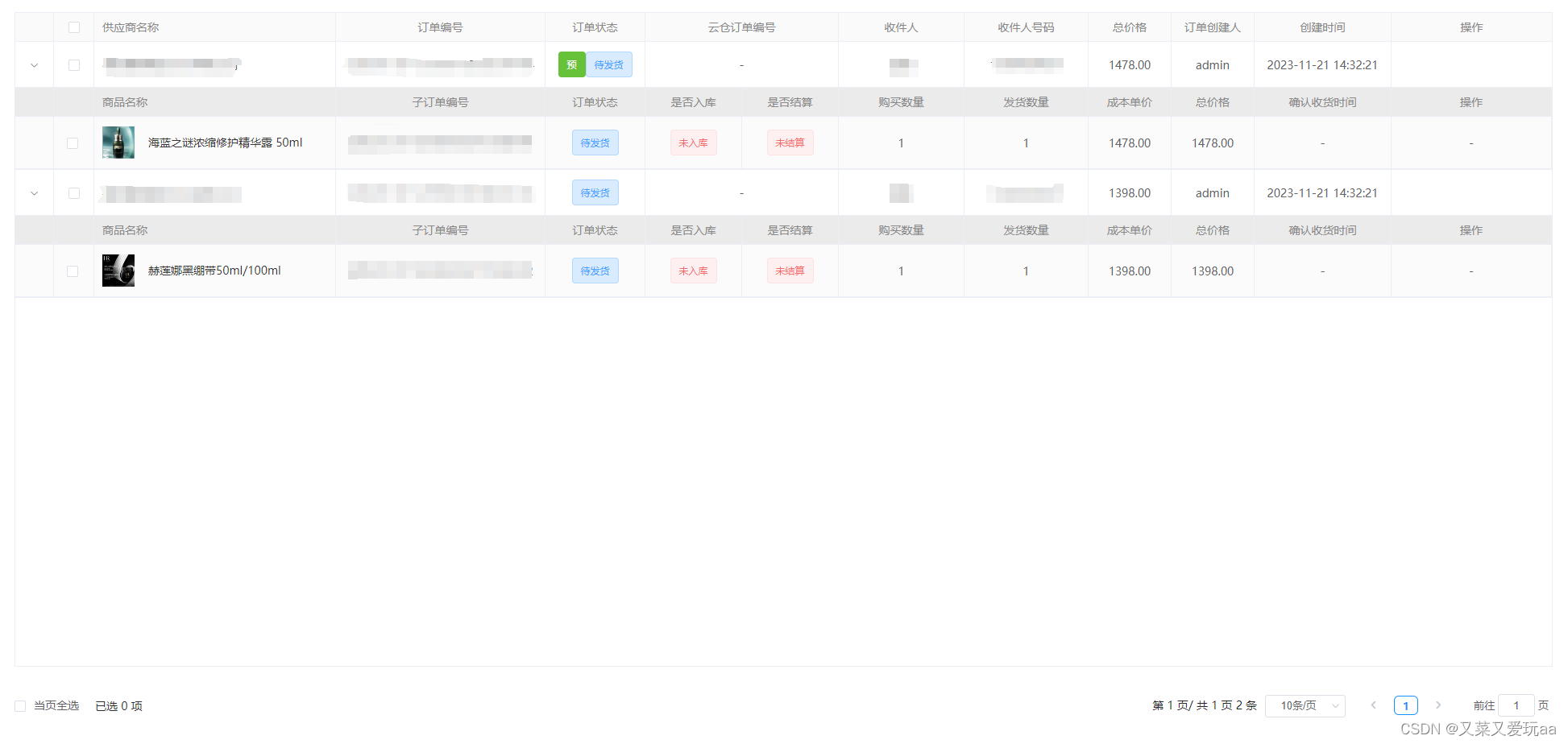
实现效果图
通过传入表头配置tablecolumn 或childrenTablecolumn二级表头配置 动态生成el-table-columns标签减少重复代码,提高代码可读性和可维护性
// 表头配置 (二级表头配置一致)
tablecolumn:[
    {
        prop: "logo",             // 展示字段名称
        label: "品牌标识" ,        // 展示字段标题
        slotName:"logo",          // 插槽名称(如一级二级插槽名称一致可复用)
        align:'left',             // 对齐方式
        width:200 ,               // 对应列的宽度
        minWidth:'200',           // 对应列的最小宽度
        sortBy:'',                // 指定数据按照哪个属性进行排序
        className:'',             // 列的 className
        countLimit:50,            // 文本显示长度,超出显示省略号,鼠标移入会tooltip弹窗显示
        columnFlag:'',            // 对应列是否可以排序
        fixed:'right',            // 列是否固定在左侧或者右侧
        emptyContent:'-',         // 展示字段为空时显示内容
    },
    ...
 ],
具体可参考以下父组件使用示例
话不多说,上代码...
组件封装代码
<template>
	<div class="commonTable">
		<el-table
			:data="tableData"
			:border="border"
			:class="['mb12', tabClass ? tabClass : null]"
			:showHeader="showHeader ? showHeader : true"
			:spanMethod="spanMethod ? spanMethod : null"
			element-loading-text="加载中..."
			v-loading="loading"
			:height="height ? height : null"
			:maxHeight="maxHeight ? maxHeight : null"
			:ref="tabRef ? tabRef : null"
			:header-cell-style="smallRow ? lineStyle : null"
			:header-cell-class-name='cellClass'
			:cell-style="smallRow ? cellStyle : null"
			:stripe="stripe"
			@row-click='rowClick'
			@sort-change="sortByKey"
			@selection-change="selectionChange"
			@select="selectFather"
			@select-all="selectAllFather"
			@expand-change="expandChange"
			:row-key="rowKey ? rowKey : null"
			:row-style="rowHeight"
			:default-expand-all="isExpand"
			:tree-props="treeProps"
			:row-class-name="rowClassName"
			:lazy='lazy'
			:load='load'
		>
			<!-- 详情内容展示 需要showExpand属性 展开 -->
			<el-table-column type="expand" v-if="showExpand">
				<template scope="props">
					<slot name="expand" :data="props.row">
						<!-- 表格嵌套 二级表格 需要 children: 表格数据名称(当前行row 包含的字段名) -->
						<div class="childrenTable">
							<el-table
								:data="props.row[children]"
								@select-all="selectAllChild($event, props.$index)"
								:ref="`childTable${props.$index}`"
								:header-cell-style="smallRow ? childrenLineStyle : null"
								:header-cell-class-name='subCellClass'
								:cell-style="smallRow ? childrenCellStyle : null"
								@select="selectChild"
								:show-header="subShowHeader"
								@selection-change="childrenSelectionChange"
								:row-class-name="subClassName"
								:row-key="props.$index.toString()"
								style="width: 100%"
							>
								<el-table-column :width="selectionObj.show ? '98' : '48'" v-if="!selectionObj.fixed">
									<!-- 占位 -->
								</el-table-column>
								<!-- 【checkout复选框 需要 selectionObj {childrenShow: true, fixed: false}】 -->
								<!-- 【请在父组件 通过ref调用 子组件 getSelectedData 方法 获取已选择数据】 示例:this.$refs.table.getSelectedData() -->
								<el-table-column
									type="selection"
									align="center"
									width="50"
									v-if="selectionObj.childrenShow"
									:fixed="selectionObj.fixed ? true : false"
									reserve-selection
									:selectable='subSelectable'
								></el-table-column>
								<!-- 【childrenTablecolumn 二级表头】 如插槽名字及内容和一级表头一致,则可复用一级表格插槽 -->
								<el-table-column
									v-for="(
										{ prop, label, width, minWidth, sortBy, slotName, className, countLimit, columnFlag, fixed, align, emptyContent }, index
									) in childrenTablecolumn"
									:key="index"
									:prop="prop ? prop : null"
									:label="label ? label : null"
									:width="width ? width : null"
									:min-width="minWidth ? minWidth : null"
									:sort-by="sortBy ? sortBy : null"
									:sortable="sortBy ? (columnFlag ? 'column' : true) : null"
									:className="className ? className : null"
									:fixed="fixed ? fixed : null"
									:align="align ? align : 'center'"
								>
									<!-- 自定义tamplate -->
									<template slot-scope="{ row, $index }">
										<!-- prop没有值的情况 传整个row -->
										<div v-if="slotName">
											<!-- row 当前表格行  scope 父级表格行 -->
											<slot :name="slotName" :data="prop ? row[prop] : null" :index="$index" :row="row" :scope="props.row"></slot>
										</div>
										<!-- 字数(countLimit控制)超出显示tip -->
										<div v-else>
											<div v-if="row[prop] && row[prop].length > (countLimit ? countLimit : 50)">
												<el-tooltip effect="dark" :content="row[prop]" placement="top" popper-class="tooltipsCont">
													<span class="limitInfo">{{ row[prop] | textSubstr(countLimit ? countLimit : 50) }}</span>
												</el-tooltip>
											</div>
											<div v-else>
												<span>{{ emptyContent || row[prop] | emptyText }}</span>
											</div>
										</div>
									</template>
								</el-table-column>
							</el-table>
						</div>
					</slot>
				</template>
			</el-table-column>
			<!-- checkout复选框  selectionObj对象 {show: true, childrenShow: false, fixed: true}  -->
			<!-- 如selectionObj对象{show: 0 } 则不显示父表格复选框 -->
			<el-table-column
				type="selection"
				align="center"
				width="50"
				v-if=" selectionObj.show == 0 ? selectionObj.show : (selectionObj.show || selectionObj.childrenShow)"
				:fixed="selectionObj.fixed ? true : false"
				:selectable='selectable'
			>
			</el-table-column>
			<el-table-column
				v-for="(
					{ prop, label, width, minWidth, sortBy, slotName, countLimit, childrenList, className, columnFlag, fixed, align, emptyContent }, index
				) in tablecolumn"
				:key="index"
				:prop="prop ? prop : null"
				:label="label ? label : null"
				:width="width ? width : null"
				:min-width="minWidth ? minWidth : null"
				:sort-by="sortBy ? sortBy : null"
				:sortable="sortBy ? (columnFlag ? 'column' : true) : null"
				:className="className ? className : null"
				:fixed="fixed ? fixed : null"
				:render-header="renderHeader ? renderHeader : null"
				:align="align ? align : 'center'"
			>
				<!-- 自定义表头 -->
				<template slot="header">
					<slot v-if="slotName" :name="slotName + 'Header'"></slot>
				</template>
				<!-- 自定义内容 -->
				<template v-if="!childrenList" slot-scope="{ row, $index }">
					<!-- 自定义tamplate -->
					<!-- prop没有值的情况 传整个row -->
					<div v-if="slotName">
						<slot :name="slotName" :data="prop ? row[prop] : null" :index="$index" :row="row"></slot>
					</div>
					<!-- 字数(countLimit控制)超出显示tip -->
					<div v-else>
						<div v-if="row[prop] && row[prop].length > (countLimit ? countLimit : 50)">
							<el-tooltip effect="dark" :content="row[prop]" placement="top" popper-class="tooltipsCont">
								<span class="limitInfo">{{ row[prop] | textSubstr(countLimit ? countLimit : 50) }}</span>
							</el-tooltip>
						</div>
						<div v-else>
							<span>{{ emptyContent || row[prop] | emptyText }}</span>
						</div>
					</div>
				</template>
				<!-- [多级表头] 如果有多组数据 注: 必传prop  childrenList为数据配置项 childrenList  -->
				<div v-if="childrenList && childrenList.length > 0">
					<el-table-column
						v-for="(item, index) in childrenList"
						:label="item.label"
						:key="index"
						:width="width ? width : null"
						:min-width="minWidth ? minWidth : 100"
						align="center"
					>
						<template slot-scope="{ row, $index }">
							<!-- 自定义tamplate -->
							<div v-if="slotName">
								<!-- 插槽传值 data:数组数据 prop:当前数组对象的key index:行索引 -->
								<slot :name="slotName" :data="prop ? row[prop] : []" :prop="item.prop" :rowData="row" :index="$index"></slot>
							</div>
							<!-- 不是自定义默认遍历数据 row[prop] 获取数组 item.prop为数组配置项的prop -->
							<div v-else>
								<div class="flex-column">
									<div v-for="(dataItem, dataIndex) in row[prop]" :key="dataIndex">
										{{ dataItem[item.prop] }}
									</div>
								</div>
							</div>
						</template>
					</el-table-column>
				</div>
			</el-table-column>
		</el-table>
		<!-- 分页插槽 -->
		<slot name="el-pagination"></slot>
	</div>
</template>
<script>
import Sortable from 'sortablejs';
export default {
	data() {
		return {
			selectAllChildMap: new Map(),
		};
	},
	props: {
		tableData: {
			// 数据源【必传】
			type: Array,
			default: () => {
				return [];
			},
		},
		tablecolumn: {
			// 一级表头【必传】
			type: Array,
			default: () => {
				return [];
			},
		},
		childrenTablecolumn: {
			// 二级表头【表格嵌套必传】
			type: Array,
			default: () => {
				return [];
			},
		},
		children: {
			// 二级表格 数据名称(当前行row 包含的字段名称)【表格嵌套必传】
			type: String,
			default: '',
		},
		contrastKey: {
			// 二级表格 复选框 数据对比字段 【复选框表格嵌套必传】
			type: Object,
			default: () => {
				return {
					f: 'id', // 父级id
					s: 'id', // 子级id
				};
			},
		},
		showExpand: {
			// 是否展示详情行(展开)
			type: Boolean,
			default: false,
		},
		isExpand: {
			// 是否自动展开详情行
			type: Boolean,
			default: false,
		},
		treeProps:{		// 树型结构 渲染树形数据时,必须要指定 row-key
			type: Object,
			default: () => {
				return {
					children: 'children',		// 当 row 中包含 children 字段时,被视为树形数据
					hasChildren: 'hasChildren',  // 通过指定 row 中的 hasChildren 字段来指定哪些行是包含子节点。
				};
			},
		},
		lazy:{	// 是否懒加载子节点数据
			type: Boolean,
			default: false,
		},
		selectionObj: {
			//是否展示详情行 多选框	{show: true, childrenShow: true, fixed: true}
			type: Object,
			default: () => {
				return {
					show: false, // 一级表格 是否开启 复选框
					childrenShow: false, // 二级表格 是否开启 复选框 (只传 childrenShow:true 时 一级表格勾选自动开启)	如selectionObj对象{show: 0 } 则不显示父表格复选框
					// 多选表格【请在父组件 通过ref调用 子组件 getSelectedData 方法 获取已选择数据】 示例:this.$refs.table.getSelectedData()
					fixed: false, // 位置
				};
			},
		},
		tabRef: {
			//  表格ref【表格多选必传】 获取动态table高度=> this.tableHeight = window.innerHeight - this.$refs.[ref名].$el.offsetTop
			type: String,
			default: 'table',
		},
		loading: {
			//loading
			type: Boolean,
			default: false,
		},
		stripe: {
			//斑马纹
			type: Boolean,
			default: false,
		},
		rowHeight: {
			// 表头行高
			type: Object,
			default: () => {
				return {
					height: '48px',
				};
			},
		},
		lineStyle: {
			// 一级表格 表头样式
			type: Object,
			default: () => {
				return {
					'font-size': '14px',
					height: '36px',
					padding: '3px 0',
					background: '#FAFAFA',
					color: '#888',
					'font-weight': '500',
				};
			},
		},
		cellStyle: {
			// 一级表格 行样式
			type: Object,
			default: () => {
				return {
					'font-size': '14px',
				};
			},
		},
		rowClassName:{			// 一级表格 单元格的 className 的回调方法,也可以使用字符串为所有单元格设置一个固定的 className
			type:[Function,String],
			default:()=>{
				return ''
			}
		},
		subClassName:{		// 二级表格 单元格的 className 的回调方法,也可以使用字符串为所有单元格设置一个固定的 className
			type:[Function,String],
			default:()=>{
				return ''
			}
		},
		subShowHeader: {
			// 是否显示二级表头
			type: Boolean,
			default: false,
		},
		childrenLineStyle: {
			// 二级表格 表头样式
			type: Object,
			default: () => {
				return {
					'font-size': '14px',
					height: '36px',
					padding: '3px 0',
					background: '#EBEBEB',
					color: '#888',
					'font-weight': '500',
				};
			},
		},
		childrenCellStyle: {
			// 二级表格 行样式
			type: [Object,Function],
			default: () => {
				return {
					'font-size': '14px',
					'background-color': '#FBFBFB',
				};
			},
		},
		border: {
			// 边框
			type: Boolean,
			default: false,
		},

		height: {
			// 表格高度
			type: Number,
			default: 0,
		},
		maxHeight: {
			//表格最大高
			type: Number,
			default: 0,
		},
		smallRow: {
			// 控制表格行高
			type: Boolean,
			default: true,
		},
		showHeader: {
			//是否显示表头
			type: Boolean,
			default: false,
		},
		spanMethod: {
			//合并行合并列
			type: Function,
		},
		renderHeader: {
			//自定义表头
			type: Function,
		},
		tabClass: {
			//	表格class [拖动表格需要的参数]
			type: String,
			default: '',
		},
		rowKey: {
			//	表格唯一标识 [拖动表格需要的参数]
			type: [String,Function],
			default: '',
		},
		dragTableFlag: {
			//是否可拖动表格排序 [拖动表格需要的参数] -【此功能尚未完善,慎用!!!】
			type: Boolean,
			default: false,
		},
		selectable:{		// 一级表格 仅对 type=selection 的列有效,类型为 Function,Function 的返回值用来决定这一行的 CheckBox 是否可以勾选
			type:Function,
			default:()=>{
				return true
			}
		},
		subSelectable:{		// 二级表格 仅对 type=selection 的列有效,类型为 Function,Function 的返回值用来决定这一行的 CheckBox 是否可以勾选
			type:Function,
			default:()=>{
				return true
			}
		},
		cellClass:{			// 一级表格 表头单元格的 className 的回调方法,也可以使用字符串为所有表头单元格设置一个固定的 className。
			type:[Function,String],
			default:()=>{
				return ''
			}
		},
		subCellClass:{			// 二级表格 表头单元格的 className 的回调方法,也可以使用字符串为所有表头单元格设置一个固定的 className。
			type:[Function,String],
			default:()=>{
				return ''
			}
		}
	},
	methods: {
		//排序
		sortByKey(column) {
			let params = {};
			if (column.order) {
				if (column.column) {
					params.orderBy = column.column.sortBy;
					params.desc = column.column.order === 'descending';
					params.order = true;
				}
			} else {
				//排序恢复
				params.order = false;
			}
			// else {//自定义初始化排序 看情况传入
			//例如
			// params.orderBy = 'avgSales'
			// params.desc = true
			// }
			this.$emit('sortChange', params);
		},
		// 加载子节点数据的函数,lazy 为 true 时生效,函数第二个参数包含了节点的层级信息	Function(row, treeNode, resolve)
		load(row, treeNode, resolve){
			this.$emit('load',row, treeNode, resolve)
		},
		// 父级表格 某一行被点击时触发
		rowClick(row, column, event){
			this.$emit('rowClick',row, column, event)
		},
		// 一级多选表格checkbox(已选中数据)
		selectionChange(val) {
			let arr = this.filterArr(val);
			// console.log(arr, '@selectionChange , 一级多选表格(已选中数据)');
			this.$emit('selectionChange', arr);
		},
		// 拖拽排序 【此功能尚未完善,慎用!!!】
		rowDrop() {
			const tbody = document.querySelector(`.${this.tabClass} .el-table__body-wrapper tbody`);
			const _this = this;
			Sortable.create(tbody, {
				draggable: '.el-table__row',
				onEnd({ newIndex, oldIndex }) {
					if (newIndex !== oldIndex) {
						const currRow = _this.tableData.splice(oldIndex, 1)[0];
						_this.tableData.splice(newIndex, 0, currRow);
						_this.$emit('getDragTableSort', _this.tableData);
					}
				},
			});
		},
		// 监听展开行状态
		expandChange(row, rows) {
			this.$emit('expandChange', row, rows);
		},
		// 一级表格单选多选
		selectFather(selection, row) {
			if (this.selectionObj.childrenShow) {
				const isCheck = selection.includes(row);
				this.tableData.forEach((item, index) => {
					if (item[this.contrastKey.f] === row[this.contrastKey.f]) {
						this.$refs[this.tabRef].toggleRowExpansion(item, true);
						const tempList = row[this.children];
						this.$nextTick(() => {
							if (tempList.length !== 0) {
								tempList.forEach((childItem) => {
									this.selectAllChildMap.set(index, item);
									this.$refs[`childTable${index}`].toggleRowSelection(childItem, isCheck);
								});
							}
						});
					}
				});
			}
			this.$emit('selectFather', selection, row);
		},
		//tableSelect  表格选择回显
		tableSelectFun(arr, index) {
			if (!arr) return;
			this.$nextTick(() => {
				arr.forEach((childItem) => {
					this.$refs[`childTable${index}`].toggleRowSelection(childItem, true);
				});
			});
		},
		// 一级表格全选
		selectAllFather(e) {
			let arr = this.filterArr(e);
			if (this.selectionObj.childrenShow) {
				this.tableData.forEach(async (item, index) => {
					await this.$refs[this.tabRef].toggleRowExpansion(item, true);
					if (arr.length !== 0) {
						this.tableSelectFun(item[this.children], index);
						this.selectAllChild(item[this.children], index);
					} else {
					}
					this.$refs[`childTable${index}`].clearSelection();
				});
			}
			this.$emit('selectAllFather', arr);
		},
		// 二级表格 单选
		childrenSelectionChange(val) {
			this.$emit('childrenSelectionChange', val);
		},
		// 二级表格全选
		selectAllChild(selection, clickIndex) {
			if (selection.length > 0) {
				const fatherRow = this.tableData.find((item) => {
					return item.id === selection[0].id;
				});
				this.selectAllChildMap.set(clickIndex, fatherRow);
				this.$refs[this.tabRef].toggleRowSelection(this.selectAllChildMap.get(clickIndex), true);
			} else {
				this.$refs[this.tabRef].toggleRowSelection(this.selectAllChildMap.get(clickIndex), false);
				this.selectAllChildMap.delete(clickIndex);
			}
		},
		// 二级表格单选多选
		selectChild(selection, row) {
			const isCheck = selection.length > 0;
			this.tableData.forEach((item, index) => {
				if (item[this.contrastKey.f] === row[this.contrastKey.s]) {
					this.selectAllChildMap.set(index, item);
					this.$refs[this.tabRef].toggleRowSelection(item, isCheck);
				}
			});
			this.$emit('selectChild', selection, row);
		},
		// 过滤数组 中undefined
		filterArr(arrList) {
			let optionsDatas = arrList.filter((item) => item !== undefined);
			return optionsDatas;
		},
		// 获取二级表格已选数据 【只能选取已展开行的数据,折叠则会移除元素,无法获取DOM】
		getSelectedData() {
			let arr = [];
			this.tableData.forEach((item, index) => {
				if (this.$refs[`childTable${index}`]) {
					arr.push(...this.$refs[`childTable${index}`].store.states.selection);
				}
			});
			// console.log(arr,'二级表格已选数据');
			return arr;
		},
		// 清除所有表格已选数据
		clearSelection() {
			this.$refs[this.tabRef].clearSelection();
			this.tableData.forEach((item, index) => {
				if (this.$refs[`childTable${index}`]) {
					this.$refs[`childTable${index}`].clearSelection();
				}
			});
		},
	},
	filters: {
		textSubstr(value, qtd = 50, mask = '...') {
			if (!value) return '-';
			return value.length > qtd ? `${value.substring(0, qtd)}${mask}` : value;
		},
		emptyText(value) {
			//数据为0的情况显示
			if (value === '') {
				return '-';
			}
			return value ?? '-'; //或者 (value !== undefined && value !== null) ? vaule : '-'
		},
	},
	mounted() {
		this.dragTableFlag && this.rowDrop();
	},
};
</script>

<style lang="scss" scoped>
.commonTable {
	::v-deep .el-table__expanded-cell {
		padding: 0 !important;
	}
}
.tooltipsCont {
	max-width: 500px;
	max-height: 450px;
}

.limitInfo {
	cursor: pointer;
}
.flex-column {
	display: flex;
	flex-direction: column;
	justify-content: center;
	align-items: center;
}
</style>

<style lang="scss">
// 解决拖拽表格滚动条,错位问题
.el-table__header-wrapper{
  padding-right: 17px !important; // 滚动条宽度
}
</style>
父组件 使用示例
<template>
  <div>
    <Table
      :tableData='tableData'
      children="list"
      :tablecolumn='tablecolumn'
      :childrenTablecolumn='childrenTablecolumn'
      ref="table"
      :selectionObj="{childrenShow:true}"
      showExpand
      :height='tableHeight'>
        <template v-slot:logo="{data}">
          <el-image
            style="width: 25px; height: 25px"
            :src="data"
            :preview-src-list="[data]">
          </el-image>
        </template>
        <template v-slot:operate="{row}">
          <el-button type="text" @click="createSubBrand(row)">新建</el-button>
          <el-button type="text" @click="editClick(row)">编辑</el-button>
          <el-button type="text" @click="deleteClick(row)">删除</el-button>
        </template>
        <template v-slot:subOperate="{row}">
          <el-button type="text" @click="subEditClick(row)">编辑</el-button>
          <el-button type="text" @click="subDeleteClick(row)">删除</el-button>
        </template>
        <template slot="el-pagination">
          <el-button type="text" @click="getSelectList">获取已选数据</el-button>
          <PagesView :pageSize='params.pageSize*1' :total='total' @currentChange='currentChange'></PagesView>
        </template>
    </Table>
  </div>
</template>


<script>
import Table from '@/components/element/table';
import PagesView from '@/components/element/pagesView';
export default {
  components:{Table,PagesView},
  data(){
    return {
      tableHeight:700,  // 一级表格高度 可通过 window.innerHeight - this.$refs.[ref名].$el.offsetTop  动态获取
      total:0,
      params:{
        pageNo:'1',
        pageSize:'10'
      },
      tableData:[     // 数据源
        {
          id:0,
          logo:'https://fuss10.elemecdn.com/e/5d/4a731a90594a4af544c0c25941171jpeg.jpeg',
          brandName:'CRICK',
          num:'159',
          time:'2022-06-09 15:25:00',
          list:[  // 嵌套二级表格数据【需把此字段名通过 children 传递】
            {
              id:10,
              logo:'https://fuss10.elemecdn.com/e/5d/4a731a90594a4af544c0c25941171jpeg.jpeg',
              brandName:'子品牌',
              num:'20',
              time:'2022-06-09 15:35:00',
            },{
              id:11,
              logo:'https://fuss10.elemecdn.com/e/5d/4a731a90594a4af544c0c25941171jpeg.jpeg',
              brandName:'子品牌',
              num:'20',
              time:'2022-06-09 15:35:00',
            },{
              id:12,
              logo:'https://fuss10.elemecdn.com/e/5d/4a731a90594a4af544c0c25941171jpeg.jpeg',
              brandName:'子品牌',
              num:'20',
              time:'2022-06-09 15:35:00',
            }
          ]
        },
        {
          id:1,
          logo:'https://fuss10.elemecdn.com/e/5d/4a731a90594a4af544c0c25941171jpeg.jpeg',
          brandName:'CRICK',
          num:'158',
          time:'2022-06-09 15:25:00',
          list:[
            {
              id:10,
              logo:'https://fuss10.elemecdn.com/e/5d/4a731a90594a4af544c0c25941171jpeg.jpeg',
              brandName:'子品牌',
              num:'20',
              time:'2022-06-09 15:35:00',
            }
          ]
        },
      ],
      tablecolumn:[      // 一级表头
        { prop: "logo", label: "品牌标识" ,slotName:"logo",align:'left',width:200},
        { prop: "brandName", label: "品牌名称" },
        { prop: "num", label: "使用商品数" },
        { prop: "time", label: "创建时间" },
        { prop: "", label: "操作" ,slotName:'operate'},
      ],
      childrenTablecolumn:[   // 二级表头【如插槽名称及内容和一级表头一致可复用一级表头及插槽内容】
        { prop: "logo", label: "品牌标识" ,slotName:"logo",align:'left',width:200},
        { prop: "brandName", label: "品牌名称" },
        { prop: "num", label: "使用商品数" },
        { prop: "time", label: "创建时间" },
        { prop: "", label: "操作" ,slotName:'subOperate'},
      ]
    }
  },
  methods:{
    // 获取所有数据
    getSelectList(){
      this.$refs.table.getSelectedData()
    }
  }
}
</script>
欢迎加入 MCP 技术社区!与志同道合者携手前行,一同解锁 MCP 技术的无限可能!
更多推荐

 13
13 0
0- 0


 已为社区贡献1条内容

所有评论(0)