Vue3+Element-Plus二次封装的弹框组件
Vue3+Element-Plus二次封装的弹框组件,主要使用到了Vue的插槽和ref,使用起来比较灵活,但是同样也会麻烦一下(正常的使用还是很方便的,不需要自己定义一大堆的变量来控制弹框显示和隐藏)
·
前言: 在上一篇文章中使用到了自己封装的弹框组件,这个组件是上一家公司刚入职的时候写的,觉得用起来挺简单的,这里分享一下
1. 项目初始化(看上一篇文章即可,里面有详细的初始化步骤)
2. 下载项目依赖
这个弹框组件只需要element-plus组件库即可

npm install element-plus
// 或
yarn add element-plus
3. 编写组件
// project/src/components/DialogModal/index.vue
<!--
 * @Author: wangzhiyu <w19165802736@163.com>
 * @version: 1.1.1
 * @Date: 2023-11-22 09:56:16
 * @LastEditTime: 2024-01-18 13:55:56
 * @Descripttion: 弹框组件
-->
<template>
  <slot name="text" :row="dialog">
    <!-- 默认内容 -->
    <el-button type="primary" @click="dialog.visible = true">点击打开弹框</el-button>
  </slot>
  <el-dialog :close-on-press-escape="false" v-model="dialog.visible" :append-to-body="true" :title="title" :before-close="handleClose" :width="width" :close-on-click-modal="false" @close="close" destroy-on-close draggable="true" ref="DialogModel">
    <div :style="{ height: height }">
      <slot name="body" :row="dialog">
        <!-- 默认内容 -->
        弹框内部内容
      </slot>
    </div>
    <template #footer>
      <span class="dialog-footer">
        <slot name="footer" :row="dialog">
          <!-- 默认内容 -->
          <el-button type="primary" @click="dialog.visible = false">确认</el-button>
          <el-button @click="dialog.visible = false">关闭</el-button>
        </slot>
      </span>
    </template>
  </el-dialog>
</template>

<script setup>
import { reactive, ref } from 'vue';

const props = defineProps({
  // 弹框头部标题
  title: {
    type: String,
    required: true,
  },
  // 弹框宽度
  width: {
    type: String,
    default: '70%',
  },
  // 弹框高度
  height: {
    type: String,
    default: '',
  },
});
const emits = defineEmits(['close']);
// 弹框实例
const DialogModel = ref();
const dialog = reactive({
  visible: false,
});
const close = () => {
  emits('close');
};
const handleClose = () => {
  dialog.visible = false;
};
const getDialogRef = () => {
  return DialogModel.value;
};
defineExpose({
  dialog,
  getDialogRef,
});
</script>
<style scoped>
.dialog-footer button:first-child {
  margin-right: 10px;
}
</style>
4. 弹框组件挂载全局
// project/src/components/index.js
/*
 * @Author: wangzhiyu <w19165802736@163.com>
 * @version: 1.1.1
 * @Date: 2023-11-22 09:56:16
 * @LastEditTime: 2023-12-04 13:56:35
 * @Descripttion: 全局components
 */
import DialogModal from './DialogModal/index.vue';

// 全局方法挂载
export function components(app) {
  app.component('DialogModal', DialogModal);
}

// project/src/main.js

// ... 其他代码
import { components } from './components/index';
// 全局组件挂载
components(app);
5. 使用弹框组件
<template>
 // title: 弹框标题
 // ref: 弹框实例
 // @close: 弹框关闭方法
 // draggable: 是否允许拖动弹框
 // 其他API: ......
 <DialogModal title="弹框标题" ref="dialogModalRef" @close="close" draggable="true">
     // 触发打开弹框的按钮
    <template #text="{ row }">
      <!-- <el-button @click="openModal(row)">打开弹框</el-button> -->
      <!-- 这里使用一个空白的span是为了让默认的text插槽的内容不显示,使用ref调用DialogModal组件内部的方法来打开弹框 -->
      <span></span>
    </template>

    <!-- 弹框内部插槽 -->
    <template #body>
      <span>body</span>
    </template>

    <!-- 弹框底部插槽 -->
    <template #footer="{row}">
       <el-button>取消</el-button>
       // 关闭弹框
       <el-button @click="()=>row.visible=false">确定</el-button>
    </template>
  </DialogModal>
 </template>
 <script setup>
 // 弹框实例
 const dialogModalRef = ref();

 // 补充:
 // dialogModalRef.value.dialog.visible 属性可以控制弹框的显示隐藏
 // 弹框组件内部的所有抛出的API,dialogModalRef都可以调用
 </script>
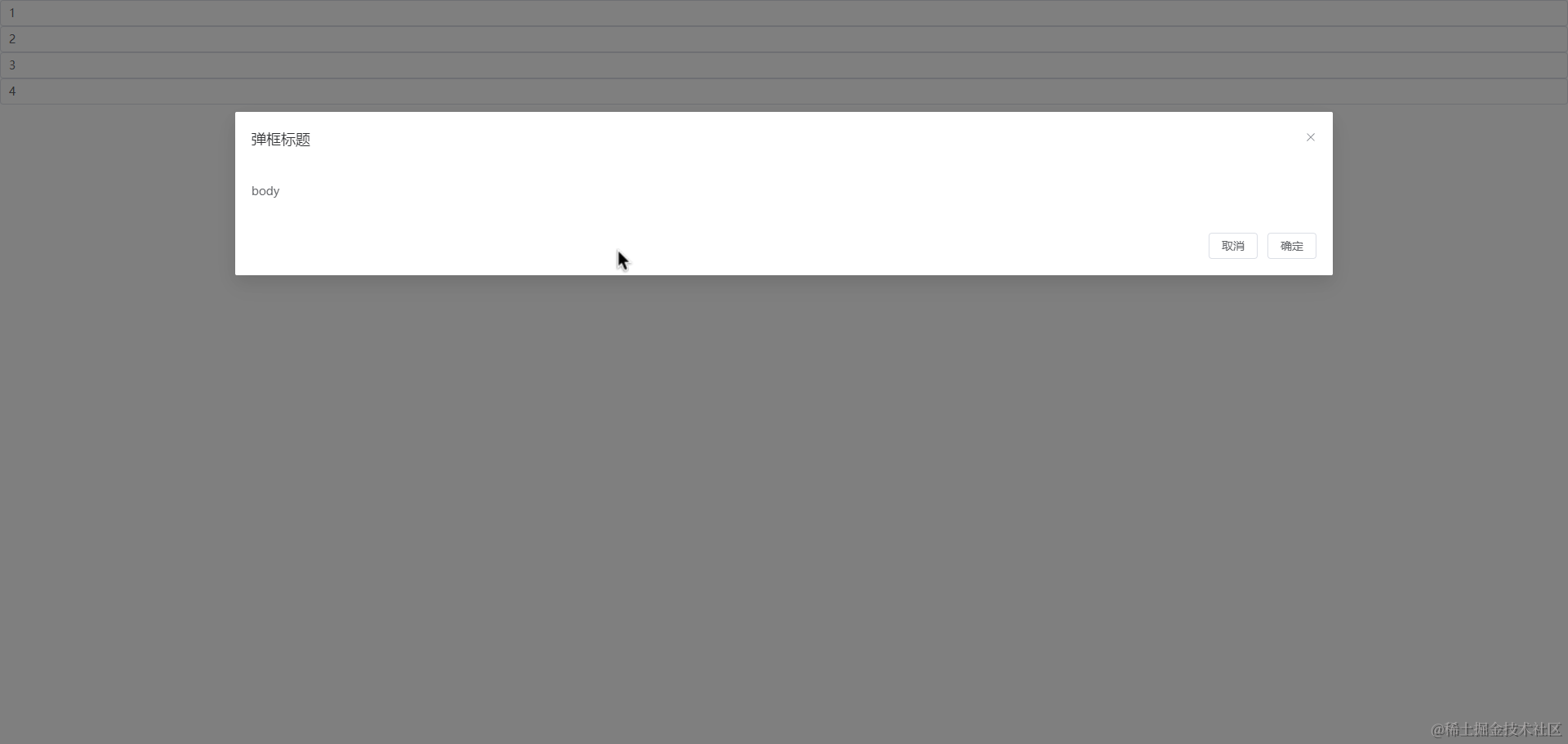
6. 效果图:
7. 总结: 以上就是使用Vue3二次封装的Element-Plus,这个组件的自定义性非常强,但是同样的,使用起来比较麻烦,用法也比较多,有兴趣的朋友可以自己挖掘一下哦😋

欢迎加入 MCP 技术社区!与志同道合者携手前行,一同解锁 MCP 技术的无限可能!
更多推荐

 5
5 0
0- 0


 已为社区贡献2条内容

所有评论(0)