基于iview UI 2.0 的 modal 对话框,进行二次封装,并可以通过v-modal属性来显示
基于iview UI 2.0 的 modal 对话框,进行二次封装,并可以通过v-modal属性来显示
·
文档
| 属性 | 说明 | 类型 | 默认值 |
| value | 对话框是否显示,可使用 v-model 双向绑定数据。 | Boolean | false |
|
center |
弹框内部的文字是否居中 | Boolean | fasle |
|
width |
弹框的宽度 | String | 400 |
| text | 弹框内部显示的文字 | String | - |
方法
| 事件名 | 说明 | 返回值 |
|
on-cancel |
点击取消的回调 | fasle |
|
on-ok |
点击确定的回调 | true |
|
on-box |
显示状态发生变化时触发 | true / fasle |
封装的子组件
<style lang="less" scoped>
.p_text{
  padding: 20px 20px;
  font-size: 18px;
}
.p_text_center{
  padding: 20px 45px;
  font-size: 18px;
  text-align: center;
}

</style>

<template>
  <div>
    <Modal footer-hide v-model="visible" :width="modalWidth">
      <Row style="margin-top:20px;">
        <Col>
          <div :class="{'p_text':more,'p_text_center':few}">{{characters}}</div>
        </Col>
      </Row>
      <Row style="margin-top:20px;">
        <Col offset="8" >
          <Button type="primary" @click="affirm">确认</Button>
          <Button type="primary" style="margin-left:50px;" ghost @click="cancel">取消</Button>
        </Col>
      </Row>
    </Modal>
  </div>
</template>

<script>
export default {
  props:{
    value:Boolean,
    center:Boolean,
    text:String,
    width:String
  },
  data(){
    return {
      more:!this.center, // 文字不居中
      few:this.center, // 文字居中
      characters:this.text,
      visible:false,
      modalWidth:this.width === undefined ? 400 : this.width
    }
  },
  watch:{
    visible(newValue){
      this.$emit("on-box",newValue)
    },

    value(newValue){
      this.visible = newValue
    }
  },
  methods:{
    cancel(){
      this.$emit("on-cancel",false)
      this.$emit("update:value", false)
      this.visible = false
    },
    affirm(){
      this.$emit("on-ok",true)
      this.$emit("update:value", true)
      this.visible = false
    },
  }
}
</script>
在需要的组件里面引用:使用时只要把popUp = true 即可,也可以自定义其他字段
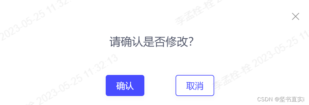
<bouncedMessage v-model="popUp"  center :width="500" :text="'请确认是否修改?'"
@on-ok="confirm" @on-cancel="onCancel" @on-box="onBox">
</bouncedMessage>
注意:由于在main.js里面全局注册了,就不需要单独引入,可以直接使用。
mian.js里引入
// 封装的组件路径
import bouncedMessage from "@/views/my-components/modal-to/bouncedMessage.vue"
Vue.component("bouncedMessage",bouncedMessage)
效果:

欢迎加入 MCP 技术社区!与志同道合者携手前行,一同解锁 MCP 技术的无限可能!
更多推荐


 0
0 0
0- 0


 已为社区贡献1条内容

所有评论(0)