Vue封装组件库-switch组件
封装switch组件组件参数及事件参数支持:参数名参数描述参数类型默认值v-model双向绑定布尔类型falsenamename属性stringtextactiveColor自定义的激活颜色string#1ec63binactiveColor自定义的不激活颜色string#dd001b事件支持:事件名称事件描述change
封装switch组件
组件参数及事件
参数支持:
| 参数名 | 参数描述 | 参数类型 | 默认值 |
|---|---|---|---|
| v-model | 双向绑定 | 布尔类型 | false |
| name | name属性 | string | text |
| activeColor | 自定义的激活颜色 | string | #1ec63b |
| inactiveColor | 自定义的不激活颜色 | string | #dd001b |
事件支持:
| 事件名称 | 事件描述 |
|---|---|
| change | change时触发的事件 |
基本结构
在components目录下创建一个switch.vue组件,其基本结构如下:
<template>
  <div class="g-switch">
    <span class="g-switch_core">
      <span class="g-switch_button"></span>
    </span>
  </div>
</template>

<script>
export default {
  name: 'GSwitch',
  props: {

  },
  methods: {

  }
}
</script>

<style lang="scss" scoped>
  .g-switch{
    display: inline-block;
    align-items: center;
    position: relative;
    font-size: 14px;
    line-height: 20px;
    vertical-align: middle;
    .g-switch_core{
    margin: 0;
    display: inline-block;
    position: relative;
    width: 40px;
    height: 20px;
    border: 1px solid #dcdfe6;
    outline: none;
    border-radius: 10px;
    box-sizing: border-box;
    background: #dcdfe6;
    cursor: pointer;
    transition: border-color .3s,background-color .3s;
    vertical-align: middle;
    .g-switch_button{
      position:absolute;
      top: 1px;
      left: 1px;
      border-radius: 100%;
      transition: all .3s;
      width: 16px;
      height: 16px;
      background-color: #fff;
      }
    }
  }
</style>
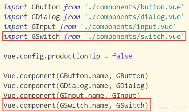
在main.js中注册组件
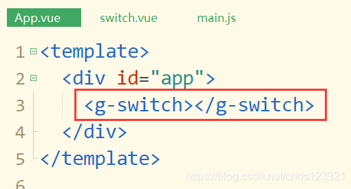
其中在父组件App.vue中调用组件
实现v-model双向数据绑定
实现switch组件数据双向绑定和input组件相同,使用v-model语法糖即可。
在父组件种通过v-model绑定数据,在组件内部获取value属性,并且定义一个回调函数与父组件通信,改变父组件中的绑定值即可。
第一步:父组件
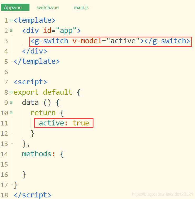
第二步:子组件接收值
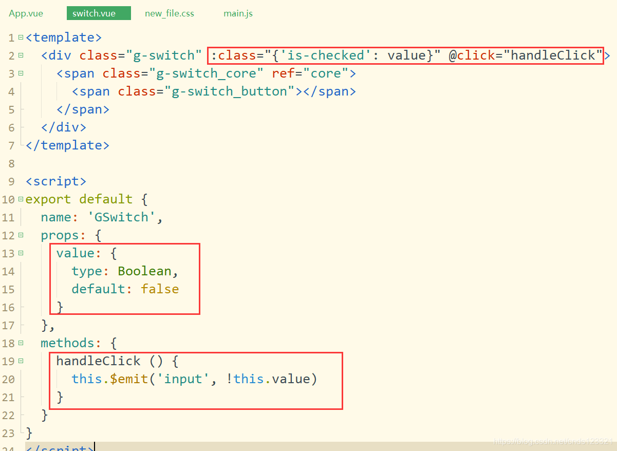
事件中必须用input
滑动样式
  // 选中样式
  .is-checked {
    .g-switch_core{
      border-color: #409eff;
      background-color: #409eff;
      .g-switch_button {
        transform: translateX(20px);
      }
    }
  }
实现switch组件颜色自定义
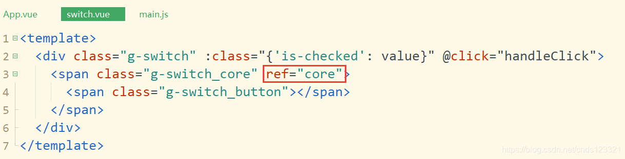
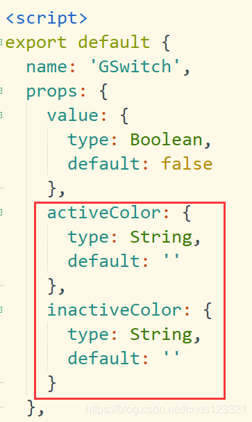
自定义switch组件的颜色,首先需要传入颜色的值,在子组件中获取后,使用ref获取节点,将背景颜色改变为对应颜色即可。
其中activeColor是选中的颜色,而inactiveColor是未选中的颜色。
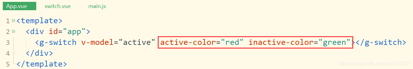
第一步:父组件传递颜色值
第二步:子组件定义ref="core"
第三步:子组件中接收值
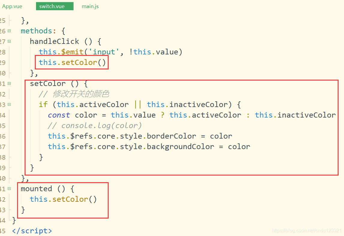
第四步:监听值变化
第五步:浏览器查看效果

name属性
用户在使用switch组件的时候,实质上是当成表单元素来使用的。因此可能会用到组件的name属性。所以需要在switch组件中添加一个checkbox,并且当值改变的时候,也需要设置checkbox的value值。
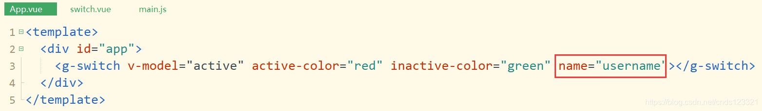
第一步:父组件传值
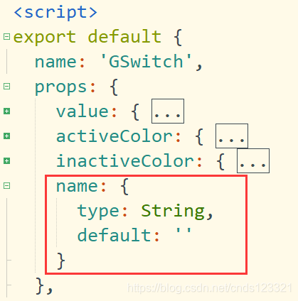
第二步:子组件通过props接收值
第三步:添加input标签并绑定属性值
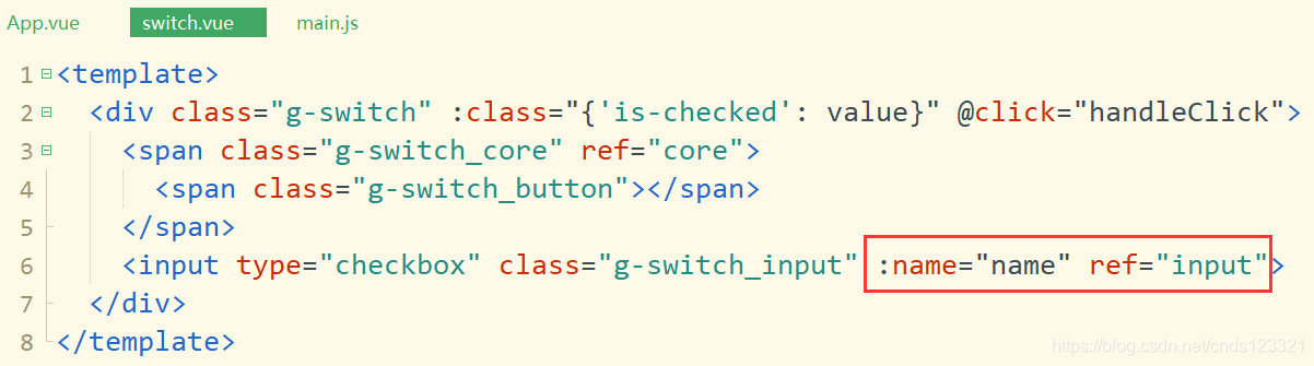
第四步:设置标签样式
// 隐藏input标签
.g-switch_input{
position:absolute;
width: 0;
height: 0;
opacity: 0;
margin: 0;
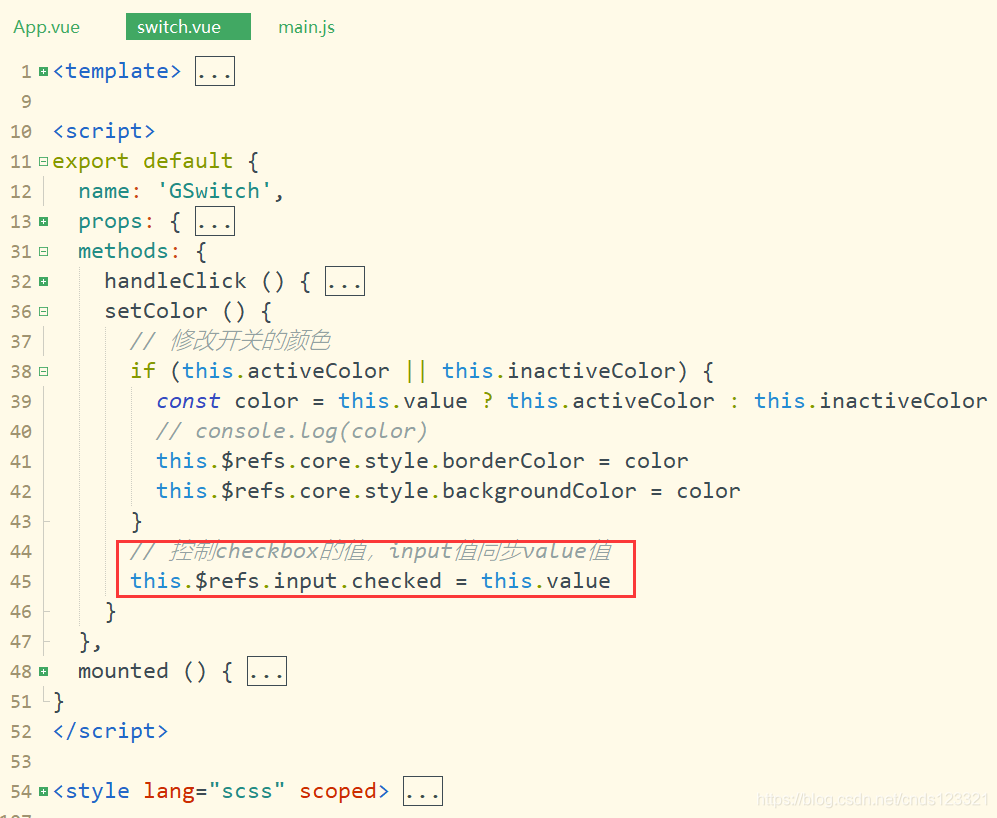
}第五步:控制checkbox的值,input值同步value值
完整代码
switch.vue组件完整代码
<template>
  <div class="g-switch" :class="{'is-checked': value}" @click="handleClick">
    <span class="g-switch_core" ref="core">
      <span class="g-switch_button"></span>
    </span>
    <input type="checkbox" class="g-switch_input" :name="name" ref="input">
  </div>
</template>

<script>
export default {
  name: 'GSwitch',
  props: {
    value: {
      type: Boolean,
      default: false
    },
    activeColor: {
      type: String,
      default: ''
    },
    inactiveColor: {
      type: String,
      default: ''
    },
    name: {
      type: String,
      default: ''
    }
  },
  methods: {
    handleClick () {
      this.$emit('input', !this.value)
      this.setColor()
    },
    setColor () {
      // 修改开关的颜色
      if (this.activeColor || this.inactiveColor) {
        const color = this.value ? this.activeColor : this.inactiveColor
        // console.log(color)
        this.$refs.core.style.borderColor = color
        this.$refs.core.style.backgroundColor = color
      }
      // 控制checkbox的值,input值同步value值
      this.$refs.input.checked = this.value
    }
  },
  mounted () {
    this.setColor()
  }
}
</script>

<style lang="scss" scoped>
  .g-switch{
    display: inline-block;
    align-items: center;
    position: relative;
    font-size: 14px;
    line-height: 20px;
    vertical-align: middle;
    .g-switch_core{
    margin: 0;
    display: inline-block;
    position: relative;
    width: 40px;
    height: 20px;
    border: 1px solid #dcdfe6;
    outline: none;
    border-radius: 10px;
    box-sizing: border-box;
    background: #dcdfe6;
    cursor: pointer;
    transition: border-color .3s,background-color .3s;
    vertical-align: middle;
    .g-switch_button{
      position:absolute;
      top: 1px;
      left: 1px;
      border-radius: 100%;
      transition: all .3s;
      width: 16px;
      height: 16px;
      background-color: #fff;
      }
    }
  }
  // 选中样式
  .is-checked {
    .g-switch_core{
      border-color: #409eff;
      background-color: #409eff;
      .g-switch_button {
        transform: translateX(20px);
      }
    }
  }
  // 隐藏input标签
  .g-switch_input{
    position:absolute;
    width: 0;
    height: 0;
    opacity: 0;
    margin: 0;
  }
</style>
App.vue父组件调用switch组件的应用
<template>
  <div id="app">
    <g-switch v-model="active" active-color="red" inactive-color="green" name="username"></g-switch>
  </div>
</template>

<script>
export default {
  data () {
    return {
      active: true
    }
  },
  methods: {

  }
}
</script>

<style lang="scss" scoped>

</style>

欢迎加入 MCP 技术社区!与志同道合者携手前行,一同解锁 MCP 技术的无限可能!
更多推荐
 0
0 0
0- 0


 已为社区贡献1条内容

所有评论(0)