CSS(盒子模型、Flex布局、CSS布局元素)
align-content适应于换行(多行)的情况下(单行情况下无效), 可以设置 上对齐、下对齐、居中、拉伸以及平均分配剩余空间等属性值。注意: 主轴和侧轴是会变化的,就看 flex-direction 设置谁为主轴,剩下的就是侧轴。max-width:是用于设置最大宽度是一个限制值,不用于设置元素的宽度。在 flex 布局中,是分为主轴和侧轴两个方向,同样的叫法有 : 行和列、x 轴和y 轴。
目录
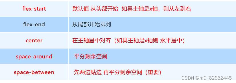
3. justify-content 设置主轴上的子元素排列方式
5. align-items 设置侧轴上的子元素排列方式(单行 )
6 align-content 设置侧轴上的子元素的排列方式(多行)
7.align-content 和align-items区别
8.flex-flow 属性是 flex-direction 和 flex-wrap 属性的复合属性
(一) 盒子模型
1.外边框 margin(padding)
margin属性可以有一到四个值。
-
margin:25px 50px 75px 100px;
-
上边距为25px
-
右边距为50px
-
下边距为75px
-
左边距为100px
-
-
margin:25px 50px 75px;
-
上边距为25px
-
左右边距为50px
-
下边距为75px
-
-
margin:25px 50px;
-
上下边距为25px
-
左右边距为50px
-
-
margin:25px;
-
所有的4个边距都是25px
-
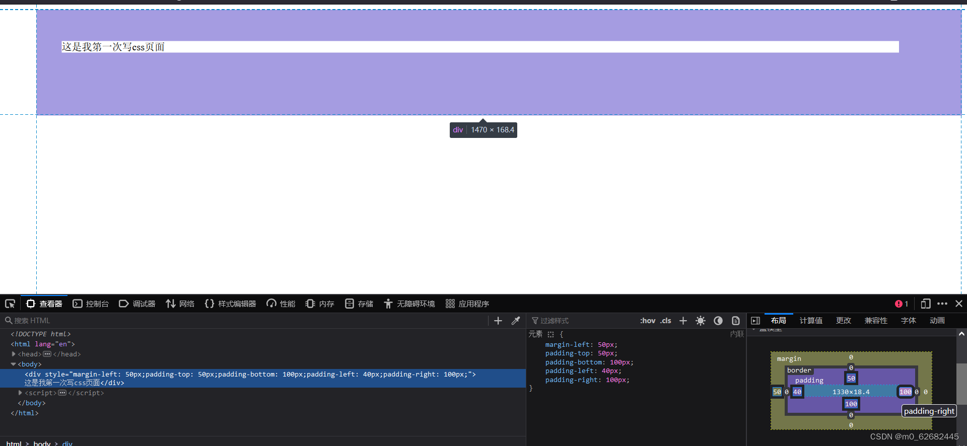
<div style="margin-top:100px;margin-bottom:100px;margin-right:50px;margin-left:50px;">
    这是我第一次写css页面
</div>
padding可以利用浏览器自己进行调试
2.border
//距离页面左边50像素;设置边框宽度1px,实线,黑色;
<div style="margin-left: 50px;border:1px solid black">
    这是我第一次写css页面
</div>
3.box-shadow
盒子模型阴影使用如下属性设置 :
box-shadow: 水平阴影 垂直阴影 模糊距离 阴影尺寸 阴影颜色 内外阴影;
只有前两个阴影 , 水平阴影和垂直阴影 必须写 , 后面的四个值可以省略 ;
4.border-radius- 指定每个圆角
-
四个值: 第一个值为左上角,第二个值为右上角,第三个值为右下角,第四个值为左下角。
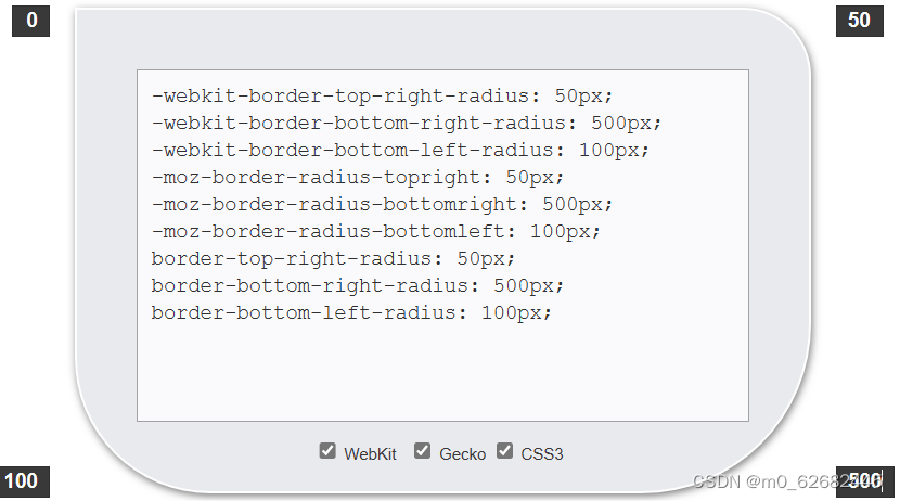
<div style="border-radius:0px 50px 500px 100px;margin-left: 50px;
background: #A9A9A9;
width: 200px;
height: 150px;">
</div>5.换行
5.1 使用 br 元素:
最简单的换行方法是在需要换行的位置插入元素。例如:
<p>This is a sentence.<br>It will be on a new line.</p>这会在 “This is a sentence.” 和 “It will be on a new line.” 之间创建一个换行。
5.2 使用 white-space 属性:
white-space 属性可以控制元素中文本的换行方式。常用的取值有:
normal(默认值):文本自动换行,默认情况下会根据容器的大小自动换行。 nowrap:文本不进行换行,超过容器宽度时会溢出。 pre:保留原始的空白符(空格和换行符),文本按照源码中的格式显示。 pre-wrap:保留原始的空白符,文本在遇到边界时会自动换行。 pre-line:合并连续的空白符,文本在遇到边界时会自动换行。
例如,将一个 div元素的 white-space 属性设置为 pre-wrap 可以实现自动换行:
<style>
  .multiline {
    white-space: pre-wrap;
  }
</style>
<div class="multiline">
  This is a long sentence that will be wrapped to the next line if necessary.
</其余详细换行内容请参考此链接
(二)Flex布局
1.布局原理
通过给父盒子添加flex属性,来控制子盒子的位置和排列方式
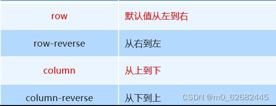
2. flex-direction设置主轴的方向
-
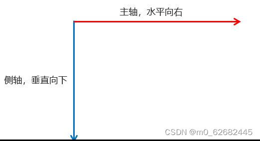
在 flex 布局中,是分为主轴和侧轴两个方向,同样的叫法有 : 行和列、x 轴和y 轴
-
默认主轴方向就是 x 轴方向,水平向右
-
默认侧轴方向就是 y 轴方向,水平向下
-
注意: 主轴和侧轴是会变化的,就看 flex-direction 设置谁为主轴,剩下的就是侧轴。而我们的子元素是跟着主轴来排列的
<style> div{ width:800px; height:300px; background-color: aquamarine; display: flex; flex-direction: row; } div span{ text-align: center; line-height: 100px; margin-left: 10px; width: 150px; height: 100px; background-color: rgb(42, 48, 165); } </style> <div> <span>1</span> <span>2</span> <span>3</span> </div>
3. justify-content 设置主轴上的子元素排列方式
jsutify-content属性使用前必须确认主轴是哪儿个。
<style>
div{
width:800px;
height:300px;
background-color: aquamarine;
display: flex;
flex-direction: row;
justify-content: space-between;//两头元素贴边对其,其余元素平分剩余空间。
}
div span{
text-align: center;
line-height: 100px;
margin-left: 10px;
width: 150px;
height: 100px;
background-color: rgb(42, 48, 165);
}
</style>4. flex-wrap设置是否换行
-
默认情况下,项目都排在一条线(又称”轴线”)上。flex-wrap属性定义,flex布局中默认是不换行的。如果装不开会缩小子元素的宽度,放到父元素里面。
-
nowrap 不换行
-
wrap 换行
5. align-items 设置侧轴上的子元素排列方式(单行 )
-
该属性是控制子项在侧轴(默认是y轴)上的排列方式 在子项为单项(单行)的时候使用
-
flex-start 从头部开始
-
flex-end 从尾部开始
-
center 居中显示
-
stretch 拉伸
<style> div{ width:800px; height:300px; background-color: aquamarine; display: flex; flex-direction: row; justify-content: space-around; align-items: center; } div span{ text-align: center; line-height: 100px; margin-left: 5px; width: 150px; height: 100px; background-color: rgb(42, 48, 165); } </style>
6 align-content 设置侧轴上的子元素的排列方式(多行)
设置子项在侧轴上的排列方式 并且只能用于子项出现 换行 的情况(多行),在单行下是没有效果的。
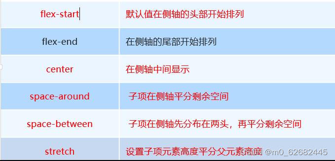
7.align-content 和align-items区别
-
align-items 适用于单行情况下, 只有上对齐、下对齐、居中和 拉伸
-
align-content适应于换行(多行)的情况下(单行情况下无效), 可以设置 上对齐、下对齐、居中、拉伸以及平均分配剩余空间等属性值。
-
总结就是单行找align-items 多行找 align-content
8.flex-flow 属性是 flex-direction 和 flex-wrap 属性的复合属性
flex-flow:row wrap;
9. flex布局子项常见属性
-
flex子项目占的份数
-
align-self控制子项自己在侧轴的排列方式
-
order属性定义子项的排列顺序(前后顺序)
10. flex 属性(常用)
flex 属性定义子项目分配剩余空间,用flex来表示占多少份数。
.item {
flex: <number>; /* 默认值 0 */
}
<style>
div{
width:800px;
height:300px;
background-color: aquamarine;
display: flex;
}
div :nth-child(1){
text-align: center;
line-height: 100px;
margin-left: 5px;
width: 150px;
height: 100px;
background-color: rgb(130, 42, 165);
margin-top: 20px;
}
div :nth-child(2){
flex: 1;//
text-align: center;
line-height: 100px;
margin-left: 5px;
width: 150px;
height: 100px;
background-color: rgb(130, 42, 165);
margin-top: 20px;
}
div :nth-child(3){
text-align: center;
line-height: 100px;
margin-left: 5px;
width: 150px;
height: 100px;
background-color: rgb(130, 42, 165);
margin-top: 20px;
}
</style>(三)CSS布局元素
1.宽度-width
width属性设置元素的宽度;max-width:是用于设置最大宽度是一个限制值,不用于设置元素的宽度。
<html>
<head>
<style type="text/css">
    img{
    width: 300px
        }
</style>
</head>
<body>
    <img        src="https://www.w3school.com.cn/i/eg_smile.gif"        />
</body>
</html>
2.高度-height
height 属性设置元素的高度。
2.1 line-height
line-height用于调整文字行与行之间的高度差。
line-height: 100px;3.字体
3.1字体
font-size: 12px;3.2粗细
font-weight: bold;//变粗3.3颜色
在线调色板,调色板工具,颜色选择器 (sojson.com)也可以选择其它先关网站
3.4定位position-relative
用于移动元素的位置
生成相对的元素,相对于正常位置定位
<span style="position: relative;left: 50px;">222222</span>3.5隐藏溢出内容-overflow-hiden
当元素内容超过规定的大小时会发生溢出,可以利用overflow-hiden隐藏,或者用 overflow:-scroll;来显示相关内容。

欢迎加入 MCP 技术社区!与志同道合者携手前行,一同解锁 MCP 技术的无限可能!
更多推荐
 20
20 0
0- 0


 已为社区贡献1条内容

所有评论(0)