纯css画三角形/梯形(兼容ie6)
代码很简单也很容易理解,及用css盒模型来实现效果实例:宽高为0的话是三角形,否则是梯形Document.triangle{width: 0;height: 0;border-style: solid;border-color: red transparent transparent transparent;border-wid
·
代码很简单也很容易理解,及用css盒模型来实现效果
实例:宽高为0的话是三角形,否则是梯形
<!DOCTYPE html>
<html lang="en">
<head>
	<meta charset="UTF-8">
	<title>Document</title>
	<style type="text/css">
		.triangle{
			width: 0;
			height: 0;
			border-style: solid;
			border-color: red transparent transparent transparent;
			border-width: 12px;
		}
		.trapezoidal{
			width: 12px;
			height: 12px;
			border-style: solid;
			border-color: green transparent transparent transparent;
			border-width: 12px;
		}
	</style>
</head>
<body>
	<div class="triangle"></div>
	<div class="trapezoidal"></div>
</body>
</html>
当然也可以把另外三遍设为 *背景色*来实现效果,也可以尝试下把三边设为不同的颜色,宽度效果也很炫酷
为了兼容ie6,border-style和font-size,line-height,overflow都要改下
#test {
    height:0;
    width:0;
    overflow: hidden; /* 这里设置overflow, font-size, line-height */
    font-size: 0;     /*是因为, 虽然宽高度为0, 但在IE6下会具有默认的 */
    line-height: 0;  /* 字体大小和行高, 导致盒子呈现被撑开的长矩形 */
    border-color:#FF9600 #3366ff #12ad2a #f0eb7a;
    border-style:solid dashed dashed dashed;/*ie6不支持颜色透明,可将边框设为dotted或dashed*/
    border-width:20px;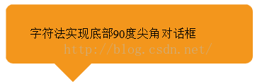
}更通用的,不用考虑兼容性的写法,用字符实现三角形
<!DOCTYPE html>
<html lang="en">
<head>
	<meta charset="UTF-8">
	<title>Document</title>
	<style>
.box{
    height:80px;
width: 300px;
    line-height:80px;
border-radius: 10px;
    margin-bottom:30px;
    padding-left:2em;
    background:#f3961c;
    position:relative;
}
.diamond{
    height:60px;
    line-height:60px;
    font-size:60px;
    color:#f3961c;
    position:absolute;
    z-index: -1;
    left:60px;
    bottom:-30px;
}
</style>
</head>
<body>
	<div class="box">
    <span class="diamond">◆</span>
    字符法实现底部90度尖角对话框
</div>
</body>
</html>
效果:
气泡框实例:
<!DOCTYPE html>
<html lang="en">
<head>
	<meta charset="UTF-8">
	<title>Document</title>
	<style type="text/css">
		.box{
			position: relative;
			width: 100px;
			height: 60px;
			line-height: 60px;
			background: blue;
			border-radius: 5px;
		}
		.box:after{
			content: "";
			width: 0;
			overflow: hidden;
			border-style: solid;
			border-color: blue transparent transparent transparent;
			position: absolute;
			bottom: -32px;
			right: 20px;
			border-width: 12px 6px 20px 18px;
		}
	</style>
</head>
<body>
	<div class="box">
	hellow word!
	</div>
</div>
</body>
</html>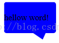
参考文章http://caibaojian.com/css-border-triangle.html#t7

欢迎加入 MCP 技术社区!与志同道合者携手前行,一同解锁 MCP 技术的无限可能!
更多推荐
 0
0 0
0- 0


 已为社区贡献1条内容

所有评论(0)