Web前端-CSS(盒模型)
很多情况下,我们不需要指定4个边框,我们是可以单独给4个边框分别指定的。上边框下边框左边框右边框border-top-style:样式;border-bottom-style:样式;border-left-style:样式;border-right-style:样式;border-top-width:宽度;border- bottom-width:宽度;border-left-width:宽度;b
1.盒子模型(CSS重点)
-
css学习三大重点: css 盒子模型、 浮动、 定位
-
盒模型主体思路:边框、内边距、外边距
1.1 看透网页布局的本质
-
网页布局中,我们是如何把里面的文字,图片,按照美工给我们的效果图排列的整齐有序呢?

-
看透网页布局的本质:
-
首先利用CSS设置好盒子的大小,然后摆放盒子的位置。
-
最后把网页元素比如文字图片等等,放入盒子里面。
-
以上两步 就是网页布局的本质

-
-
我们明白了,盒子是网页布局的关键点,所以我们更应该弄明白 这个盒子有什么特点。
1.2 盒子模型(Box Model)
-
所谓盒子模型:
-
就是把HTML页面中的布局元素看作是一个矩形的盒子,也就是一个盛装内容的容器。

总结:
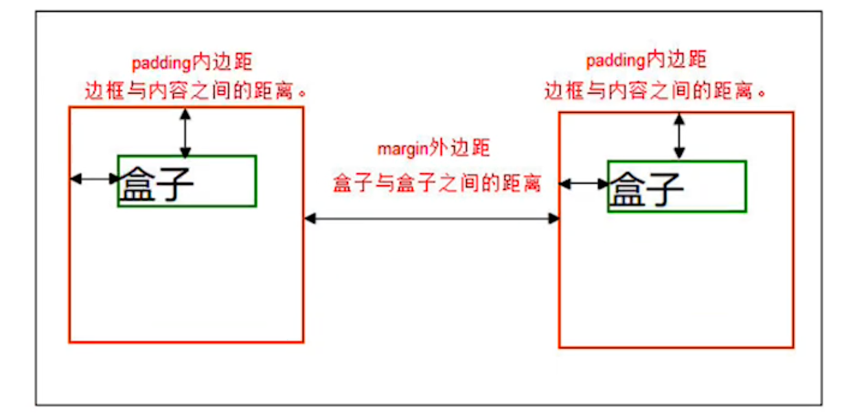
- 盒子模型有元素的内容、边框(border)、内边距(padding)、和外边距(margin)组成。
- 盒子里面的文字和图片等元素是 内容区域
- 盒子的厚度 我们成为 盒子的边框
- 盒子内容与边框的距离是内边距(也叫填充)
- 盒子与盒子之间的距离是外边距
-
2. 边框(border)
-
示图:

-
语法:
border : border-width || border-style || border-color
| 属性 | 作用 |
|---|---|
| border-width | 定义边框粗细,单位是px |
| border-style | 边框的样式 |
| border-color | 边框颜色 |
- 边框的样式:
- none:没有边框即忽略所有边框的宽度(默认值)
- solid:边框为单实线(最为常用的)
- dashed:边框为虚线
- dotted:边框为点线
div {
            width: 200px;
            height: 200px;
            background-color: red;

            border-width: 10px;
            border-style: solid;
            border-color: green;
  }
2.1 边框简写
border : border-width border-style border-color
例如:
border: 1px solid red; 没有顺序
2.2 盒子边框写法总结表
很多情况下,我们不需要指定4个边框,我们是可以单独给4个边框分别指定的。
| 上边框 | 下边框 | 左边框 | 右边框 |
|---|---|---|---|
| border-top-style:样式; | border-bottom-style:样式; | border-left-style:样式; | border-right-style:样式; |
| border-top-width:宽度; | border- bottom-width:宽度; | border-left-width:宽度; | border-right-width:宽度; |
| border-top-color:颜色; | border- bottom-color:颜色; | border-left-color:颜色; | border-right-color:颜色; |
| border-top:宽度 样式 颜色; | border-bottom:宽度 样式 颜色; | border-left:宽度 样式 颜色; | border-right:宽度 样式 颜色; |
注意:当盒子添加外边框之后,会变大,给容器的宽和高是给内容设置的。
 border-top-color: green;
 border-top-width: 5px;
 border-top-style: solid;

border-top: 20px solid orange;
border-bottom: none solid blue;
border-right: 20px solid orchid;
border-left: 20px solid green;
圆角边框(CSS3)
- 语法:
其中每一个值可以为 数值或百分比的形式。
border-radius:length;
/* border-radius: 50%; */
<head>
<meta charset="UTF-8">
<title>Document</title>
<style>
.box {
width: 100px;
height: 100px;
background-color: red;
/* border-radius: 50px; */
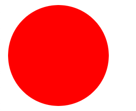
border-radius: 50%;
}
</style>
</head>
<body>
<div class="box"></div>
</body>
</html>
制作如下圆角边框
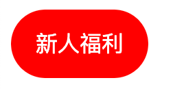
- 以上效果图矩形的圆角, 就不要用 百分比了,因为百分比会是表示高度和宽度的一半。
- 而我们这里矩形就只用高度的一半就好了
<style>
        .box {
            width: 100px;
            height: 50px;
            background-color: red;
            /* 高度的一半 */
            border-radius: 25px;
            text-align: center;
            line-height: 50px;
            color: white;
        }
</style>
<body>
    <div class="box">
        新人福利
    </div>
</body>
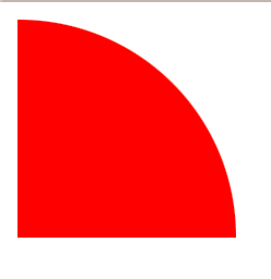
制作如下圆角边框
<head>
    <meta charset="UTF-8">
    <title>Document</title>
    <style>
        .box {
            width: 100px;
            height: 100px;
            background-color: red;
            border-top-right-radius: 100px;
        }
    </style>
</head>

<body>
    <div class="box"></div>
</body>
</html>
3. 内边距(padding)
3.1 内边距:
-
padding属性用于设置内边距。 是指边框与内容之间的距离。

3.2 设置
| 属性 | 作用 |
|---|---|
| padding-left | 左内边距 |
| padding-right | 右内边距 |
| padding-top | 上内边距 |
| padding-bottom | 下内边距 |
代码:
<head>
    <meta charset="UTF-8">
    <title>Document</title>
    <style>
        .box {
            width: 400px;
            height: 400px;
            background-color: red;
            border-top: 20px solid orange;
            border-left: 20px solid blue;
            border-bottom: 20px solid green;
            border-right: 20px solid rebeccapurple;
            font-size: 40px;

            /* 内边距距顶部30像素 */
            padding-top: 30px;
            /* 内边距距右部30像素 */
            padding-right: 40px;
            /* 内边距距底部30像素 */
            padding-bottom: 40px;
            /* 内边距距左部30像素 */
            padding-left: 40px;

        }
    </style>
</head>

<body>
    <div class="box">我就是一个内边距盒子啊</div>

</body>

</html>
当我们给盒子指定padding值之后, 发生了2件事情:
- 内容和边框有了距离,添加了内边距。
- 盒子会变大了。
注意: 后面跟几个数值表示的意思是不一样的。
我们分开写有点麻烦,我们可以不可以简写呢?
| 值的个数 | 表达意思 |
|---|---|
| 1个值 | padding:上下左右内边距; |
| 2个值 | padding: 上下内边距 左右内边距 ; |
| 3个值 | padding:上内边距 左右内边距 下内边距; |
| 4个值 | padding: 上内边距 右内边距 下内边距 左内边距 ; |
<head>
   <meta charset="UTF-8">
   <title>Document</title>
   <style>
       .box {
           width: 400px;
           height: 400px;
           background-color: red;
           border-top: 20px solid orange;
           border-left: 20px solid blue;
           border-bottom: 20px solid green;
           border-right: 20px solid rebeccapurple;

           /* 上下左右内边距都是40px */
           padding: 40px;
           /* 上下40px  左右50px */
           padding: 40px 50px;
           /* 上40px  右50px  下60px  左边也是50px*/
           padding: 40px 50px 60px;
           /* 上40px 右50px 下60px 左70px */
           padding: 40px 50px 60px 70px;

       }
   </style>
</head>

<body>
   <div class="box"></div>

</body>

</html>
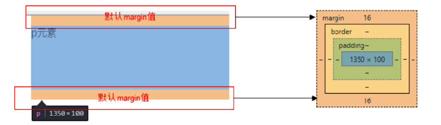
3.3 内盒尺寸计算(元素实际大小)
-
宽度
Element Width = content width + padding + border (Width为内容宽度)
-
高度
Element Height = content height + padding + border (Height为内容高度)
-
盒子的实际的大小 = 内容的宽度和高度 + 内边距 + 边框

如上图:
盒子宽度是:20+70+400+50+20=560px
盒子高度是:20+40+400+60+20=540px
- 课堂一练
- 一个盒子宽度为100, padding为 10, 边框为5像素,问这个盒子实际的宽度的是()
-
(A) 130
-
(B) 135
-
© 125
-
(D) 115
- 关于根据下列代码计算 盒子宽高下列说法正确的是()
div {

		width: 200px;
    height: 200px;
		border: 1px solid #000000;
		border-top: 5px solid blue;
		padding: 50px;
		padding-left: 100px;

		}
-
(A) 宽度为200px 高度为200px
-
(B) 宽度为352px 高度为306px
-
© 宽度为302px 高度为307px
-
(D) 宽度为302px 高度为252px

3.4 内边距产生的问题
-
问题
会撑大原来的盒子
-
解决:
- 通过给设置了宽高的盒子,减去相应的内边距/边框的值,维持盒子原有的大小
- 事先设计好,内容的宽高度,内边距和外边距和边框,合理分配
- 如果没有给一个盒子指定宽度, 此时,如果给这个盒子指定padding, 则不会撑开盒子。(看如下代码演示)
- 通过给设置了宽高的盒子,减去相应的内边距/边框的值,维持盒子原有的大小
实现文本居中显示
<head>
    <meta charset="UTF-8">
    <title>Document</title>
    <style>
        .box {
            width: 400px;
            height: 400px;
            background-color: orange;
        }

        p {
            /* 写了宽度是100% 就是内容宽的100% 不写就是父级容器的100% */
            /* width: 100%; */
            height: 100px;
            background-color: red;
            font-size: 30px;
            line-height: 100px;
            text-align: center;
            padding-right: 30px
        }
    </style>
</head>

<body>
    <div class="box">
        <p>我是一个段落</p>
    </div>
</body>
</html>
4. 外边距(margin)
4.1 外边距
margin属性用于设置外边距。 margin就是控制盒子和盒子之间的距离
<head>
    <meta charset="UTF-8">
    <title>Document</title>
    <style>
        .box {
            width: 600px;
            height: 600px;
            background-color: orange;
            border: 10px blue solid;
        }

        .box1,
        .box2,
        .box3 {
            width: 200px;
            height: 200px;
            /* 把两个盒子转换为行内块标签,这样既可以改变盒子的大小,又可以一行显示多个 */
            display: inline-block;
        }

        .box1 {
            background-color: red;
            margin-top: 50px;
            margin-left: 50px;
        }

        .box2 {
            background-color: green;
            margin-top: 50px;
            margin-left: 50px;

        }

        .box3 {
            background-color: palegreen;
            margin-top: 50px;
            margin-left: 50px;
        }
    </style>
</head>

<body>
    <div class="box">
        <div class="box1"></div>
        <div class="box2"></div>
        <div class="box3"></div>
    </div>
</body>

</html>
4.2 设置:
| 属性 | 作用 |
|---|---|
| margin-left | 左外边距 |
| margin-right | 右外边距 |
| margin-top | 上外边距 |
| margin-bottom | 下外边距 |
- margin值的简写 (复合写法)代表意思跟 padding 完全相同。
<head>
    <meta charset="UTF-8">
    <title>Document</title>
    <style>
        .box {
            width: 600px;
            height: 600px;
            background-color: orange;
            border: 10px blue solid;
        }

        .box1 {
            width: 200px;
            height: 200px;
            background-color: red;
            /* 上右下左都是30px */
            margin: 30px;
            /* 上下30px  左右40px */
            margin: 30px 40px;
            /* 上30px 右40px  下50px  左30px */
            margin: 30px 40px 50px;
            /* 上 右 下 左 */
            margin: 30px 40px 50px 60px;
        }
    </style>
</head>

<body>
    <div class="box">
        <div class="box1"></div>
    </div>
</body>

</html>
4.3 块级盒子水平居中
-
可以让一个块级盒子实现水平居中必须:
- 盒子必须指定了宽度(width)
- 然后就给左右的外边距都设置为auto,
-
实际工作中常用这种方式进行网页布局,示例代码如下:
.box{
  width:960px;
  margin: 0 auto;
}
<head>
    <meta charset="UTF-8">
    <title>Document</title>
    <style>
        .father{
            width: 400px;
            height: 400px;
            background-color: orange;
            margin: 0 auto;
        }
        .son{
            width: 200;
            height: 200;
            background-color: red;
            margin: 0 auto;
        }
    </style>
</head>

<body>
    <div class="father">
        <div class="son"></div>
    </div>
</body>

</html>
margin:0 auto 的意思是  上下边距为0px ,左右 自动,也就是居中显示。
margin:20px auto 的意思是 上下边距为 20px ,左右 自动,也是居中显示。
注意:
- 要居中的盒子必须是块标签
- 盒子必须有宽度
4.4 文字居中和盒子居中区别
text-align: center; /*  文字 行内元素 行内块元素水平居中 */
margin: 0 auto;  /* 块级盒子水平居中  左右margin 改为 auto 就可以了 上下margin都可以 */
4.5 清除元素的默认内外边距(重要)
代码示例:
<html>
<head>
    <meta charset="UTF-8">
    <meta http-equiv="X-UA-Compatible" content="IE=edge">
    <meta name="viewport" content="width=device-width, initial-scale=1.0">
    <title>Document</title>
    <style>
        *{
            margin: 0;
        }
        .box {
            width: 300px;
            height: 300px;
            background-color: red;
        }
    </style>
</head>

<body>
    <div class="box">
        <h1>123</h1>
    </div>
</body>

</html>
为了更灵活方便地控制网页中的元素,制作网页时,我们需要将元素的默认内外边距清除
* {
   padding:0;         /* 清除内边距 */
   margin:0;          /* 清除外边距 */
}
注意:
- 行内元素为了照顾兼容性, 尽量只设置左右内外边距, 不要设置上下内外边距。
4.6 外边距合并
- 使用margin定义块元素的垂直外边距时,可能会出现外边距的合并。
(1).垂直外边距(相邻块元素垂直外边距的合并)
-
当上下相邻的两个块元素相遇时,如果上面的元素有下外边距margin-bottom
-
下面的元素有上外边距margin-top,则他们之间的垂直间距不是margin-bottom与margin-top之和
-
取两个值中的较大者这种现象被称为相邻块元素的合并(也称外边距塌陷)。

解决方案:尽量给只给一个盒子添加margin值。
<head>
    <meta charset="UTF-8">
    <title>Document</title>
    <style>
        .box1,
        .box2 {
            width: 200px;
            height: 200px;
        }

        .box1 {
            background-color: orange;
            margin-bottom: 50px;
        }

        .box2 {
            background-color: blue;
            margin-top: 50px;
        }
    </style>
</head>

<body>
    <div class="box1"></div>
    <div class="box2"></div>
</body>

</html>
(2). 嵌套块元素垂直外边距的合并(塌陷)
- 对于两个嵌套关系的块元素,如果父元素没有上内边距及边框
- 父元素的上外边距会与子元素的上外边距发生合并

解决方案:
- 可以为父元素定义上边框。
- 可以为父元素定义上内边距
- 可以为父元素添加overflow:hidden。
还有其他方法,比如浮动、固定、绝对定位的盒子不会有问题,后面咱们再总结。
<!DOCTYPE html>
<html lang="en">

<head>
    <meta charset="UTF-8">
    <meta http-equiv="X-UA-Compatible" content="IE=edge">
    <meta name="viewport" content="width=device-width, initial-scale=1.0">
    <title>Document</title>
    <style>
        * {
            margin: 0;
            padding: 0;
        }

        .father {
            width: 600px;
            height: 600px;
            background-color: red;
            /* 1. 可以为父元素定义上边框。 */
            /* border: green 5px solid; */

            /* 2. 可以为父元素定义上内边距 */
            /* padding: 20px; */

            /* 3. 可以为父元素添加overflow:hidden。 */
            /* overflow: hidden */
        }

        .box1 {
            width: 200px;
            height: 200px;
            background-color: orange;
            margin-top: 40px;
        }
    </style>
</head>

<body>
    <div class="father">
        <div class="box1"></div>
    </div>
</body>

</html>
6. CSS书写规范
- 开始就形成良好的书写规范,是你专业的开始。
空格规范
【强制】 选择器 与 { 之间必须包含空格。
示例:
.selector {
}
【强制】 属性名 与之后的 : 之间不允许包含空格, : 与 属性值 之间必须包含空格。
示例:
font-size: 12px;
选择器规范
【强制】 并集选择器,每个选择器声明必须独占一行。
示例:
/* good */
.post,
.page,
.comment {
    line-height: 1.5;
}


/* bad */
.post, .page, .comment {
    line-height: 1.5;
}
【建议】 一般情况情况下,选择器的嵌套层级应不大于 3 级,位置靠后的限定条件应尽可能精确。
示例:
/* good */
#username input {

}
.comment
.avatar {

}

/* bad */
.page
.header
.login
input {

}
.comment
div
* {

}
属性规范
【强制】 属性定义必须另起一行。
示例:
/* good */
.selector {
    margin: 0;
    padding: 0;
}

/* bad */
.selector { margin: 0; padding: 0; }
【强制】 属性定义后必须以分号结尾。
示例:
/* good */
.selector {
    margin: 0;
}

/* bad */
.selector {
    margin: 0
}

欢迎加入 MCP 技术社区!与志同道合者携手前行,一同解锁 MCP 技术的无限可能!
更多推荐

 17
17 0
0- 0


 已为社区贡献1条内容

所有评论(0)